Power BI’s rich ecosystem of AppSource offers freely build solutions that can supercharge your analytics. In this guide, we will highlight several must-try free Power BI (PBI) custom visuals and additional PBI apps with pro features that Power BI users should explore in 2025.
With step-by-step instructions on how to install each one, configure or connect it to your data, and apply it in a real scenario this guide is ideal for data analysts, report builders, and IT teams, providing practical tips and best practices along the way.
1. Infographic Designer (Custom Visual by Microsoft)
What it is: A popular Power BI custom visual by Microsoft for creating rich, pictogram-based charts. It extends Power BI’s native bar, column, and line visuals by letting you use shapes, images, and precise layouts to craft pictorial representations. For example, you can make icon-based bar charts (pictograms), stylized KPI cards, or layered infographics that tell a story. It’s great for dashboard elements that need a bespoke design touch without coding.
How to Install: In Power BI Desktop, click the … (ellipsis) in the Build pane and choose Get more visuals. From AppSource visuals, search for “Infographic Designer”.
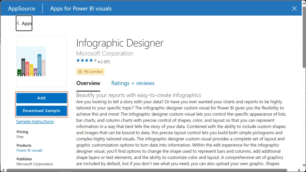
Click Add. The Infographic Designer icon will appear in your Visual gallery. Also Download Sample PBIX, this lets you explore the features of the Infographic Designer with the fictitious data.
Why it’s useful: This visual is ideal when you want to beautify reports with thematic visuals or tell an engaging data story. You can layer multiple shapes and text on data points, tile icons to represent quantities, or fill images to show proportions. Infographic Designer assists in the development of visually appealing presentations and displays by facilitating the incorporation of these “small details” that are not possible with conventional charts.
Example Scenario – “Wine Sales”: Which regions lead wine consumption, and how has that changed over the last five years?
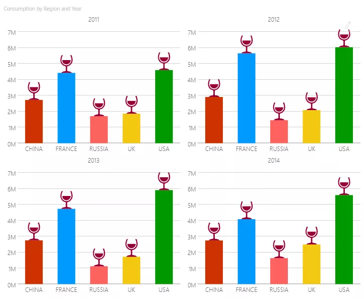
This infographic designer uses small-multiples grid to display four identical-scale (0–7M) column charts for 2011–2014. Fixed category order (China, France, Russia, UK, USA) and consistent colours let the viewers compare across years. The wine-glass callouts simply spotlight yearly peaks 🍷. Read left to right and the narrative is immediate—USA leads and holds #1 in 2011–2014 followed by France, while China sits mid-pack with a flat trend, and Russia remains lowest. It’s clean, on-brand, and disciplined.
2. Chiclet Slicer (Custom Visual by Microsoft)
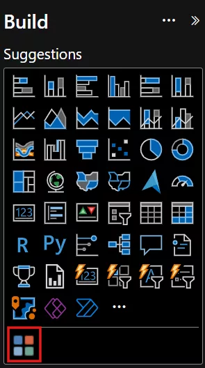
How to Install: In Power BI Desktop, click the … (ellipsis) in the Build pane and choose Get more visuals. From AppSource visuals, search for “Chiclet Slicer”.
What it is: An enhanced slicer visual by Microsoft that provides button-based filtering with plenty of customization. Inspired by Excel’s slicers, Chiclet Slicer lets you display filter values as interactive buttons (text or images) arranged in a grid or row for efficient use of space. It supports cross-highlighting and even images on the buttons, making your report filters more visual and user-friendly.
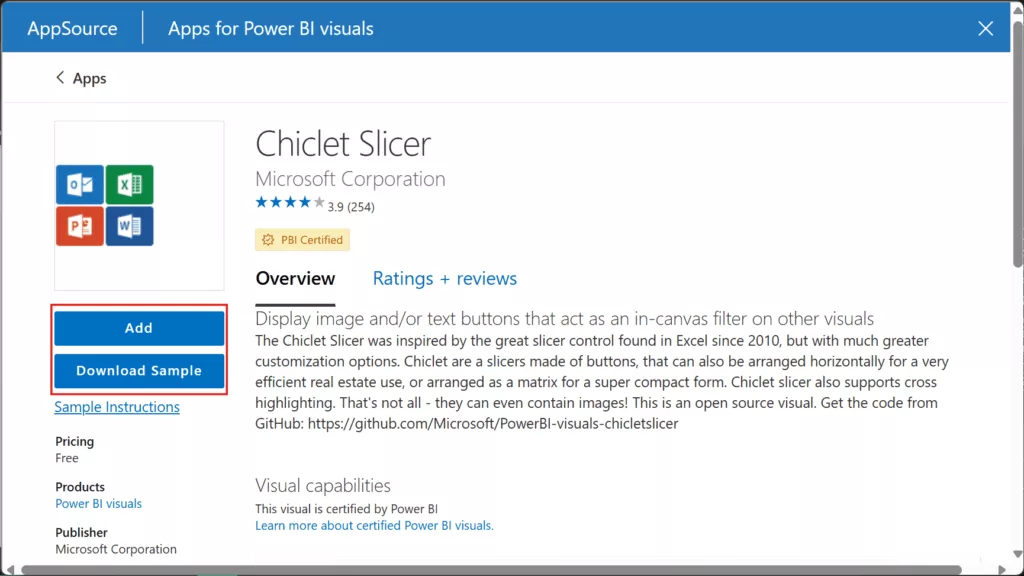
Click Add. The Chiclet Slicer icon will appear in your Visual gallery. Also Download Sample PBIX, this lets you explore the features of the Chiclet Slicer with the fictitious data.
Why it’s useful: Chiclet Slicer is extremely handy for building intuitive navigation and interactive filtering in reports. Instead of a plain checklist filter, you can create eye-catching buttons (even with icons or logos) that act as in-canvas filters. This is great for scenarios like switching between regions by clicking country flags, or filtering products by clicking product images. It makes the slicer experience more engaging for end users, without any complex setup.
Example Scenario – “Power BI Integrations”: Which connectors account for the largest share of reports (e.g., Excel vs SQL vs SharePoint)?

This page uses a Chiclet Slicer as navigation/filter grid. Each branded button (Excel, SQL Server, SharePoint, Salesforce, etc.) is a chiclet with a logo image, arranged in a tidy multi-column layout. Users can click on a connector logo to filter the rest of the page—here, the pie chart will instantly update to show the volume of reports by the selected source(s). Most of the reports uses Excel connection for Power BI integration.
3. Play Axis (Dynamic Slicer) – Custom Visual by mprozil
What it is: A unique dynamic slicer visual that adds “play” controls to your reports. The Play Axis visual allows you to animate other Power BI visuals by cycling through a field (typically a date or time) without user interaction. Essentially, it’s like a play button for your charts: once activated, it will iterate through the values (e.g. months or years) and update the visuals continuously.
How to Install: In Power BI Desktop, click the … (ellipsis) in the Build pane and choose Get more visuals. From AppSource visuals, search for “Play Axis”.
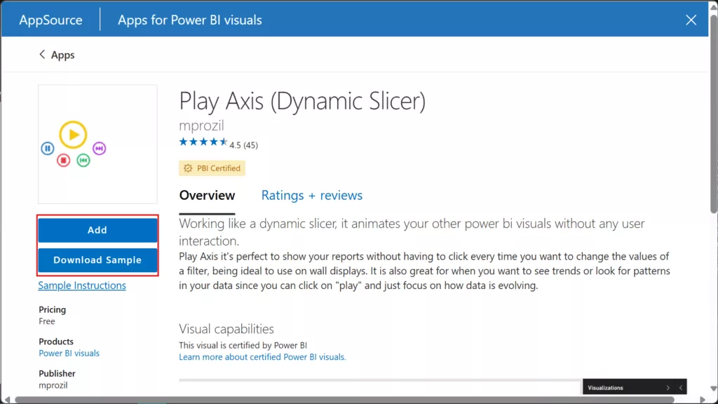
Click Add. The Play Axis icon will appear in your Visual gallery. Also Download Sample PBIX, this lets you explore the features of the Play Axis with the fictitious data.
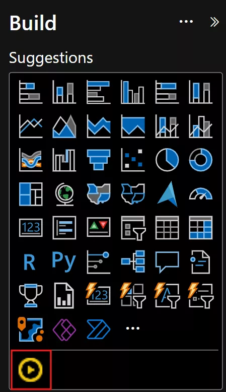
Why it’s useful: Play Axis is perfect for showing trends over time or sequences in an automated way. For example, you can place a time field on the Play Axis and hit play to watch a line chart progress through months, or a map evolve over years. This makes it ideal for unattended displays (like a wall monitor dashboard) or when you want to observe patterns without manually clicking a slicer. It creates a more dynamic storytelling experience, helping viewers focus on how the data evolves.
Example Scenario – “Monthly Sales”: How do monthly sales evolve through the year, and for each month, which products drive the result?
The Play Axis is bound to Month Name. Press ▶️ to auto-step Jan → Dec. The “Month Name” label updates as the slider moves, acting as a clear time context. Left Column chart shows a yearly trend so you can spot seasonality (e.g., a spike in October/December, decline in March/August). Right chart – Sales by Product, filters to the current month and reveals the product mix (e.g., Paseo dominates in peak months, while Amarilla/VTT carry quieter months). Together, you get a hands-free story, when sales peak and which products are responsible month-by-month.
4. Charticulator Visual Community (View) – Custom Visual by Ilfat Galiev
What it is: Charticulator Visual (Community) is a custom visual for Power BI that enables fully custom chart designs created with Microsoft’s Charticulator tool. It is essentially the community-supported successor to Microsoft’s original Charticulator visual (retired in 2023). Developed by Ilfat Galiev, this visual lets you incorporate bespoke charts in your Power BI reports without writing code. Unlike the full Charticulator Editor (which includes an in-report design interface), the View version has no built-in editor – it is display-only, meant for rendering pre-built Charticulator chart templates inside Power BI. This separation makes the visual lighter and Power BI certified, ensuring it’s secure and optimized for use in production reports. In practice, you design or obtain a chart template (a .tmplt file) using Charticulator (either the old web app or the new community Editor visual) and then use the Charticulator View visual to bind your data and display that custom visualization in Power BI. This allows report authors to unleash full design flexibility – from custom infographics to novel chart types – all within Power BI’s interactive reports.
How to Install: In Power BI Desktop, open the Build pane, click the “Get more visuals" (ellipsis … menu), and search for “Charticulator Visual Community (View)”. Select the visual and click Add to import it into your report.
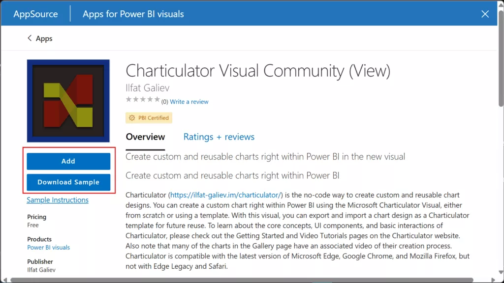
How to Use it in a Report: Now that the visual is installed, let’s walk through using it with a Charticulator chart template. The general workflow is adding the visual to your report, assign data fields, import a Charticulator template, and map the data. You can either use an existing template (for example from the Charticulator gallery or a community sample) or design your own using Charticulator’s editor. Below is a step-by-step guide using a sample .tmlpt template:
1. In Power BI Desktop, click the Charticulator Visual (View) icon in the Build pane to create a new instance of the visual on your report page. Resize it as desired.
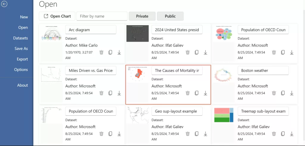
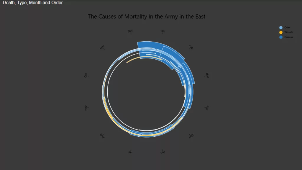
2. To download a template go to ilfat-galiev.im. From left bar navigate to Open. Find “The Causes of Mortality in the Army in the East” card. Click on it to open the template.
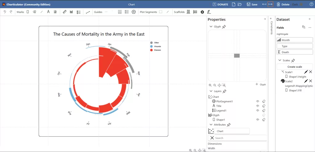
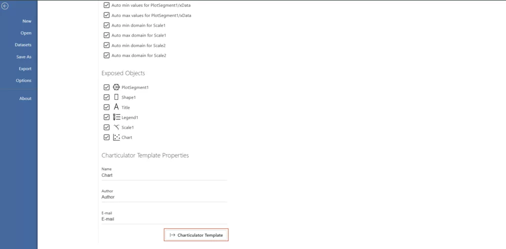
3. Click the Export icon (→). Clcik on Charticulator Template. This saves a .tmlpt file to your machine.
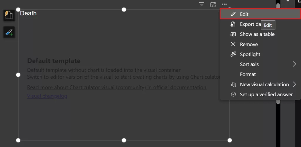
4. Now in Power BI Desktop, Click the More options menu (⋯) on the top right of the Charticulator visual. Choose Edit.
5. In edit mode, you’ll see an interface to import Charticulator charts. Click Import, then browse to the Charticulator .tmlpt file you want to use.
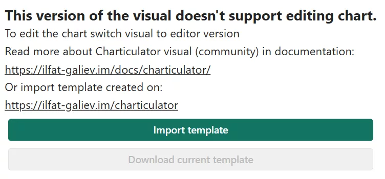
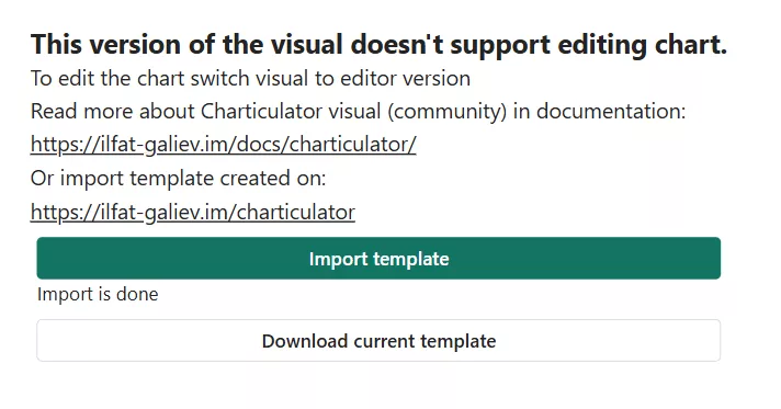
6. After you import the template. Click on download current template.
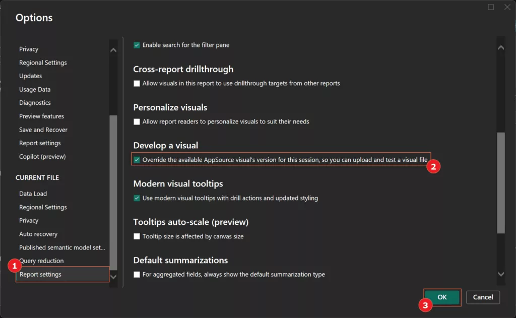
7. By default, Power BI may block uncertified or file-imported visuals.

8. To enable it, go to File > Options and settings > Options, then under Current File > Report settings, check Develop a visual and click OK.
9. For this chart, the template expects “Month” and the “type” measure fields.

10. Assign the appropriate fields from your data model to each required template field, then click Confirm.
Pro Tip: If you ever need to create a new Charticulator template from scratch within Power BI, you can install the companion Charticulator Visual Community (Editor) (the non-certified editor-included version) for development. You’d design the chart there, save the template, and then load that template into the View visual for better performance in published reports. Alternatively, use the online Charticulator app to craft your chart template, then follow the above steps to import it into Power BI.
How it’s useful: Charticulator empowers analysts to go beyond standard visuals without needing to write TypeScript or D3 code. If you have a very specific chart in mind (a custom diagram, an unusual timeline, etc.), you can likely create it by arranging marks and anchors in Charticulator’s interface. It’s incredibly flexible for advanced use cases – yet accessible, since it’s entirely drag-and-drop. For anyone who has ever hit the limits of default visuals, Charticulator offers a free way to craft exactly the visualisation you need and use it directly in Power BI.
Add-On Apps for Power Users (Service Only)
Note: Power BI Template Apps install in the Service and typically require Pro to publish/view unless the workspace is in Premium/Fabric. They’re free to install but not license-free.
1. Microsoft 365 Usage Analytics (Microsoft)
What it is: A Power BI app by Microsoft that tracks your organization’s usage of Microsoft 365 services. This template app combines Microsoft 365 service usage data with your Azure Active Directory (Entra ID) user metadata to provide rich adoption and usage reports. You’ll get dashboards showing how users are utilizing tools like Teams, SharePoint, Exchange, Yammer, etc., and trends in active users and product adoption over time.
How to Install: In Power BI Service, navigate to Apps > Get Apps, and search for “Microsoft 365 Usage Analytics”.
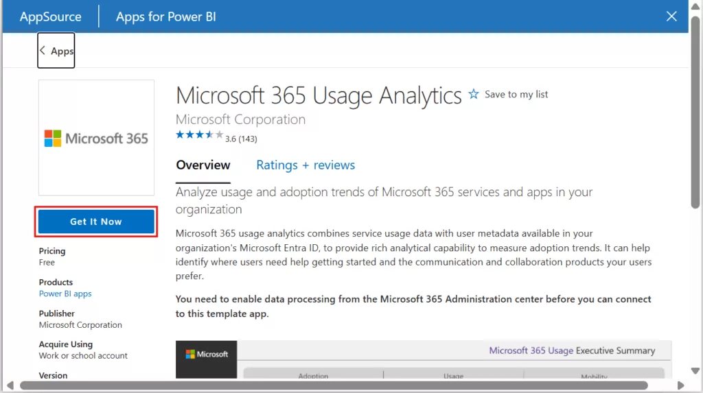
Click Get it now to install the app into your workspace. Open the installed Microsoft 365 Usage Analytics app. Initially, it will display sample data.
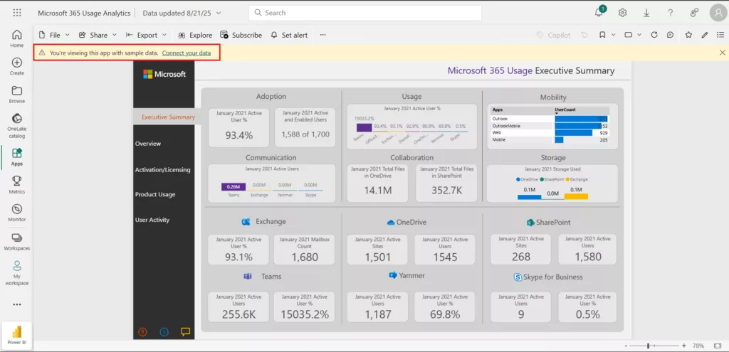
Click Connect your data and provide the required credentials. You’ll need to be a Microsoft 365 global admin or have the Reports reader role to authenticate and load your organization’s data.
Why it’s useful: For IT departments and business leaders, this app offers visibility into M365 adoption and helps identify where to improve. You can pinpoint which services are thriving or underutilized and see, for example, if Teams usage spiked after a training campaign. The analytics can highlight where users might need help getting started and which collaboration products users prefer.
2. Azure Cost Management App (Template App)
What it is: A free Power BI app from Microsoft that provides detailed insight into your Azure cloud spending. It includes reports for subscription costs, resource group costs, and Reserved Instances usage, helping you analyse and optimize Azure expenditures.
How to Install: – In Power BI Service, go to Apps > Get Apps, search “Azure Cost Management App”, and click Get it now.
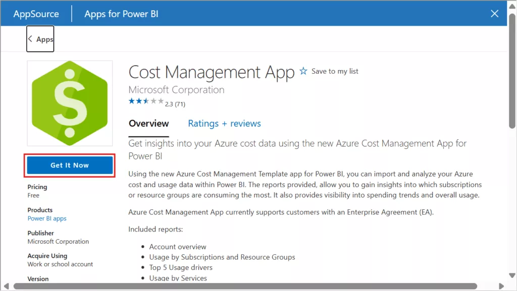
Confirm installation. The app will appear in your Apps content list with sample data until connected to your Azure billing data. Upon opening the app, click Connect your data. You’ll be prompted to enter your Azure Enrolment Number and credentials.
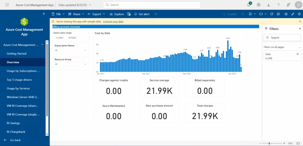
Why it’s useful: This app helps you see where money’s going, why it’s changing, and how to cut waste—right inside Power BI. Best for Enterprise Agreement (EA) tenants that want out-of-the-box cost, usage, RI coverage/savings, and price-sheet reporting.
3. FlowViz for Jira (Agile Metrics Template App
What it is: FlowViz is a Power BI template app (by Thrivve Partners) designed for Agile teams to visualize their work metrics from Jira Cloud. It provides dashboards for cycle time, throughput (completed work items), work in progress, and even probabilistic forecasting of project completion. In short, it gives scrum masters and project managers actionable insights into their software development process – identifying bottlenecks and trends in delivery.
How to Install: In Power BI Service, go to Apps > Get Apps and search for “FlowViz for Jira”. Click on “Get it now".
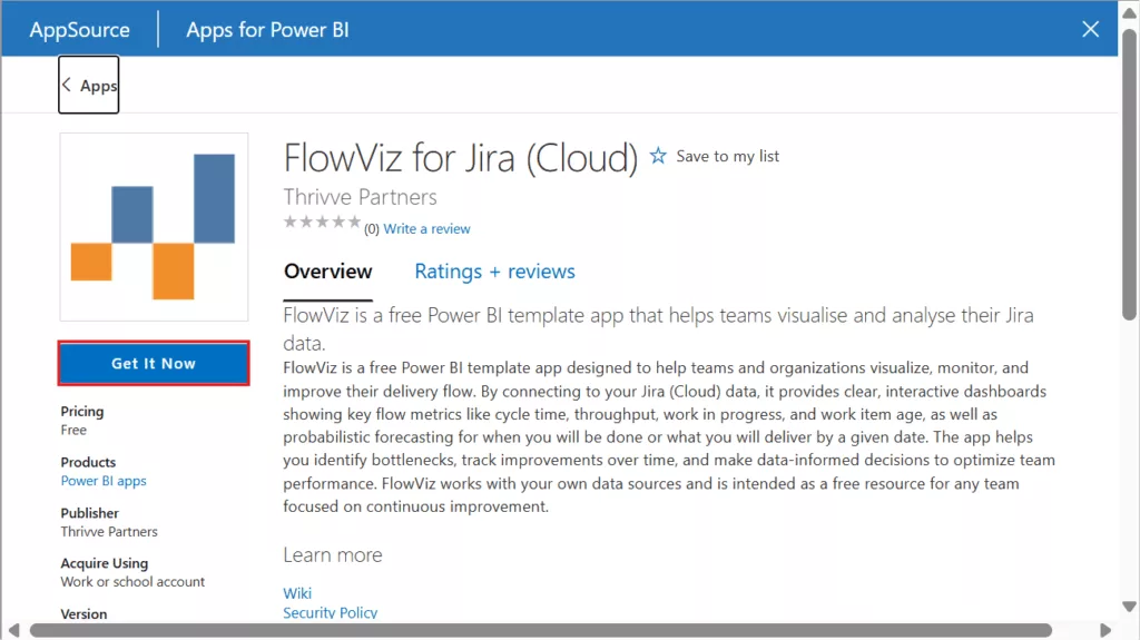
The app will install with a full set of sample dashboards. After installation, open the app from your Apps list – you’ll see a Dashboard that shows key performance indicators: productivity (throughput of items completed), quality (bug rate), responsiveness (cycle time), and predictability (net flow).
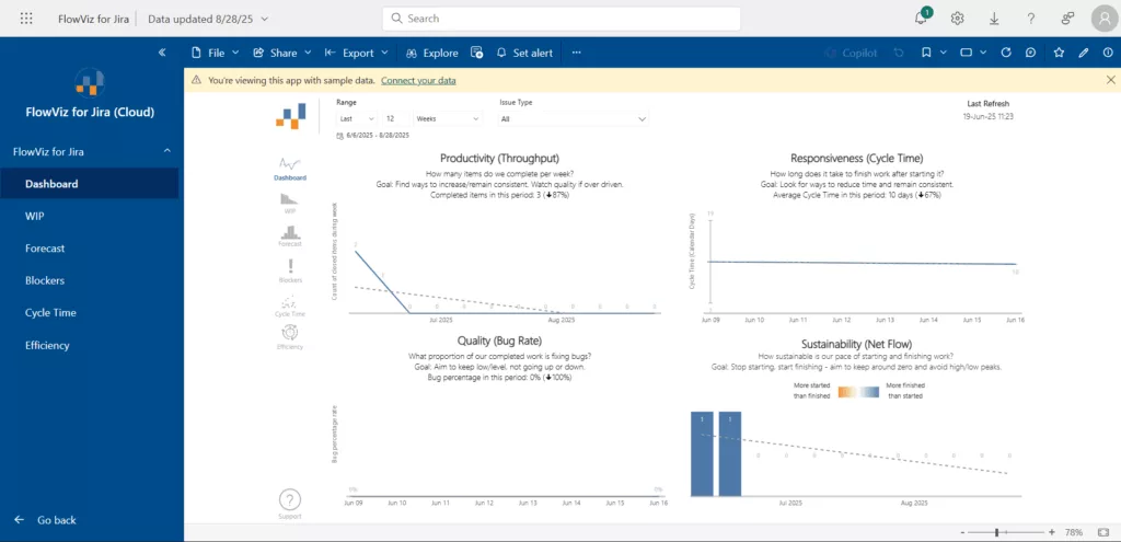
Why it’s useful: This app can be used to review charts such as Flow Efficiency or Blockers during agile retrospectives and determine areas for team improvement. Additionally, it facilitates progress tracking over time. For instance, if you implement daily bug triage meetings, you can monitor whether bug rates decrease in subsequent sprints. Just be aware that big Jira projects can cause it to lag, so for better performance, filter by boards or epics.
In conclusion
With so many excellent visuals available for free, AppSource is best source of inspiration for Power BI users. You can enhance your reports with new features and insights and jumpstart solutions by experimenting with these template apps and custom visuals. The best part is that they require little setup and no coding—just click “Get it now” and begin exploring.