
To make a chart in Excel, select your data, open the Insert tab, and pick a chart type, or click Recommended Charts and let Excel choose for you. A chart turns rows of numbers into a picture people actually read. This guide shows you how to create one step by step in current Excel, how to pick the right chart type, and how to format it so it looks professional.
Chart vs graph in Excel: what’s the difference?
In everyday use, and in Excel, “chart” and “graph” mean the same thing. Excel calls every visual a chart, whether it’s columns, a line, or a pie. “Graph” is just the word many people use for the same feature. So don’t overthink the terminology: the steps below make both.
How to make a chart in Excel (step by step)
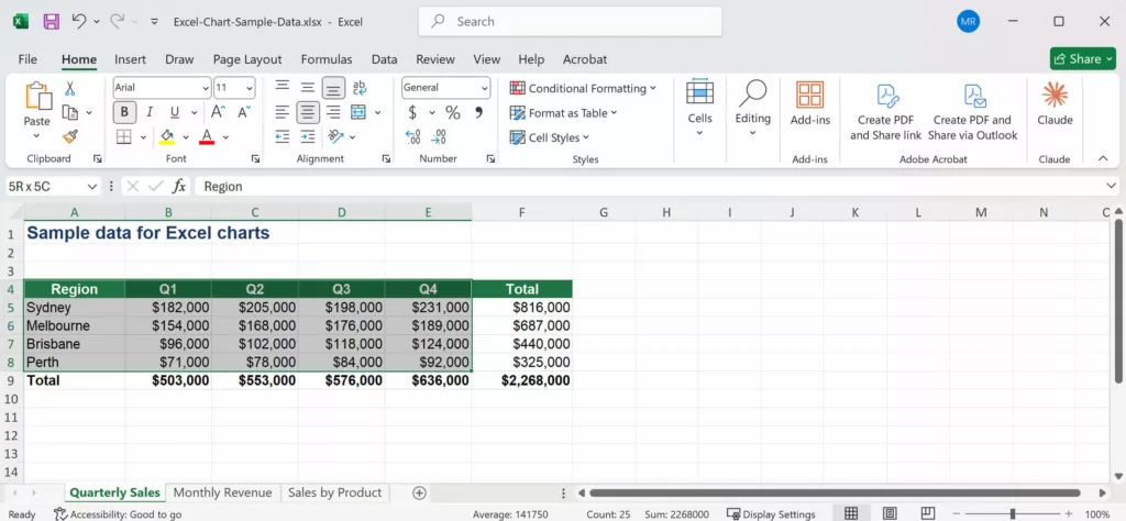
- Enter your data in a simple table, with labels in the first column (or row) and values beside them. Keep it tidy: one header row, no blank rows in the middle.
- Select the data you want to chart, including the headers.
- Go to the Insert tab on the ribbon.
- In the Charts group, either click a specific chart type (Column, Line, Pie, and so on), or click Recommended Charts to see Excel’s suggestions.
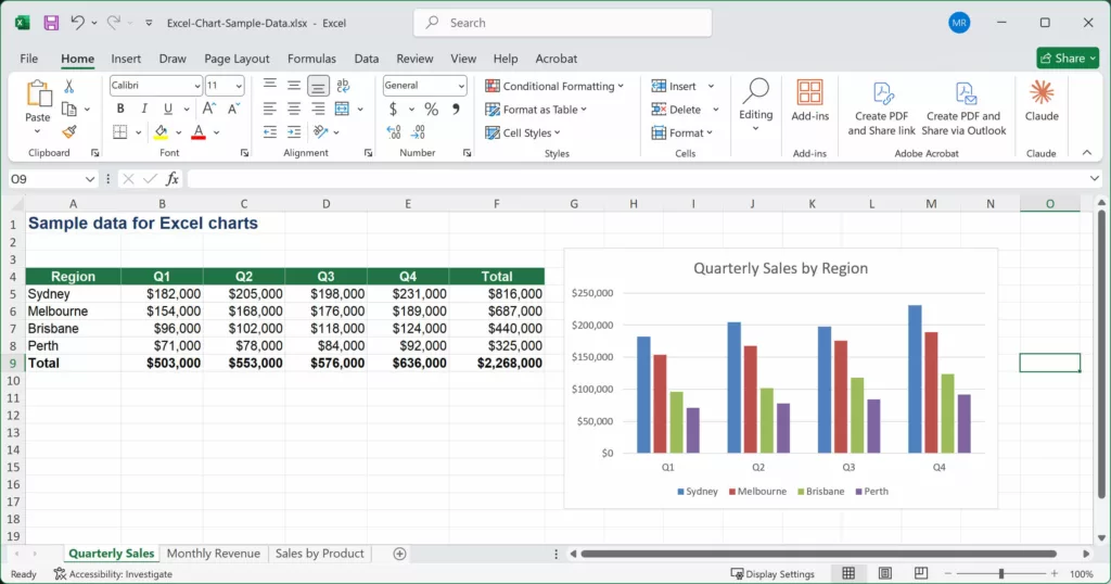
- Choose a chart. Excel inserts it straight onto your worksheet.
- With the chart selected, use the Chart Design and Format tabs (they appear only when a chart is selected) to refine it.

That’s the whole process. Everything after this is refinement.
The fastest way: Recommended Charts
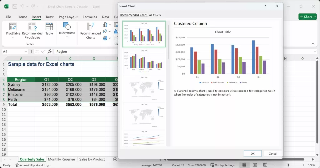
Recommended Charts (Insert tab > Recommended Charts) is the quickest route and usually the best for beginners. Excel looks at your data and previews the chart types that suit it, so you’re not guessing. Select your data, click Recommended Charts, browse the previews, and pick one. It’s the two-click method most people use today.
Keyboard shortcut: with your data selected, press Alt + F1 to drop a default chart onto the same sheet instantly, or F11 to create it on its own dedicated chart sheet.
Which chart type should you use?
Picking the right type is what separates a clear chart from a confusing one. A quick guide:
- Column or bar: comparing values across categories (sales by region, headcount by team). Columns are vertical; bars are horizontal and suit long category names.
- Line: showing a trend over time (revenue by month, visitors by week).
- Pie or doughnut: showing parts of a whole, when you have just a few categories. Avoid it for more than about five slices.
- Scatter (XY): showing the relationship between two numeric variables (price vs sales).
- Combo: plotting two different measures together (revenue as columns, margin percentage as a line on a secondary axis).
- Newer types: modern Excel also offers Histogram (distribution), Waterfall (running totals and variances), Treemap and Sunburst (hierarchies), Funnel (stages in a process) and Map charts (geographic data). Find them under Insert > Charts.
How to format and customise your chart
Once the chart is on the sheet, click it and use these controls:
- Chart Elements (the + button beside the chart): switch chart title, axis titles, data labels, legend, gridlines and trendline on or off.
- Chart Styles (the brush icon, or the Chart Design tab): apply a ready-made style and colour scheme in one click.
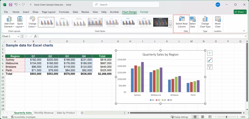
- Chart Design tab: change the chart type, switch the row and column orientation (Switch Row/Column), add chart elements, and move the chart to its own sheet.
- Format tab: fine-tune colours, borders, effects and the size of individual chart parts. Double-click any element to open its detailed Format pane.
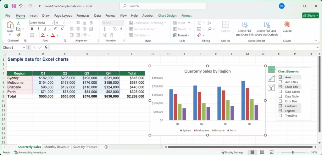
Tip: if your chart plots the wrong way around (categories and series swapped), select the chart and click Chart Design > Switch Row/Column. It’s the single most common fix.
Common chart problems (and how to fix them)
- The chart plots the wrong data: use Chart Design > Select Data to correct the ranges, or Switch Row/Column to flip the orientation.
- Too many categories make it unreadable: summarise the data first (a PivotTable helps), or switch to a bar chart so long labels fit.
- Duplicate or messy source data: clean it before charting. Use Data > Remove Duplicates and sort the data so the chart reads logically.
- The chart doesn’t update: if you added rows, make sure they fall inside the chart’s data range, or base the chart on an Excel Table (Insert > Table) so it expands automatically.
Practice on your own data
Charts click into place the moment you build a few on real data with someone to show you the shortcuts. That’s exactly how our Excel courses work.
Charts and graphs are covered in depth in our Excel Intermediate course, part of our full range of instructor-led Excel training courses, in-class in Sydney and Melbourne or Online Live across Australia.
Frequently asked questions
In Excel there is no real difference. Excel calls every visual a chart, whether it’s columns, a line or a pie. “Graph” is simply the everyday word many people use for the same thing, so the steps to make one are identical.
Select your data including the headers, go to the Insert tab, and either choose a chart type from the Charts group or click Recommended Charts and pick one of Excel’s suggestions. The chart appears on your worksheet, ready to format.
Select your data and press Alt + F1 to insert a default chart on the same sheet, or press F11 to create the chart on its own separate chart sheet.
Use column or bar charts to compare categories, line charts to show trends over time, pie charts for parts of a whole with only a few categories, and scatter charts to show the relationship between two numbers. When unsure, use Recommended Charts.
Select the chart and click the Chart Elements button (the plus sign beside it), then tick Chart Title and Axis Titles. Click each placeholder to type your text. You can also manage these from the Chart Design tab.
Yes. Select all the columns you want to include, then insert your chart. Excel plots each column as a separate series. For two very different measures, use a Combo chart with a secondary axis.
