
The Data Analysis Expressions – DAX is a powerful and versatile formula language used in business intelligence tools such as Power BI, Excel, Power Pivot, and SQL Server Analysis Services (SSAS) Tabular. It plays a pivotal role in creating dynamic visualizations, leading to insightful data analysis. Mastering DAX is essential for getting the most value out of these tools, it empowers analysts towards data-driven decision-making.
This step-by-step guide elaborates on the value of DAX in business intelligence tools and the professional significance of mastering it.
Measures vs. Calculated Columns: What’s the Difference?
| Feature | Calculated Column | Measure |
|---|---|---|
| Evaluation Time | Row-by-row (when data is loaded) | On the fly (when queried) |
| Storage | Takes up space in the model | No extra storage required |
| Use Case | Creating new data fields | Aggregating/analyzing data |
Tip: Use measures when you’re calculating totals, averages, or business KPIs.
Step-by-Step: Writing Basic DAX Formulas
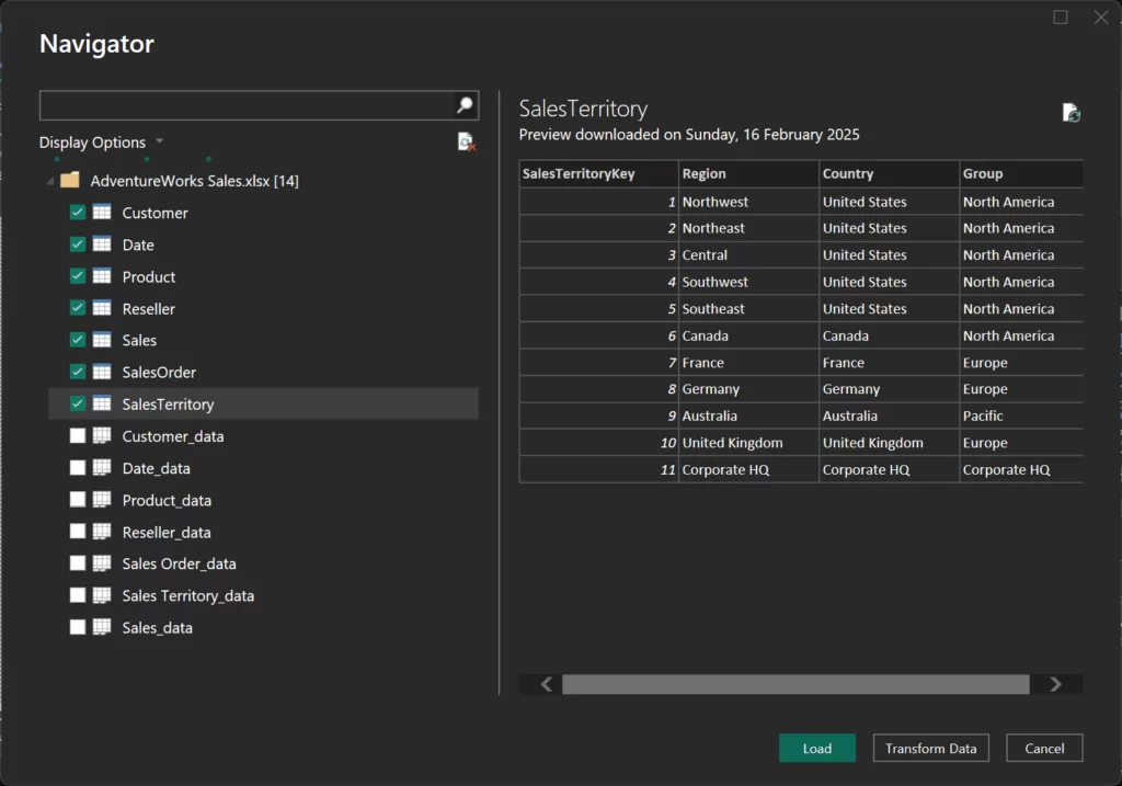
Step 1: Load the Dataset
- Download the Adventure Works Sales dataset.
- Open Power BI Desktop.
- Go to Home > Get Data > Excel.
- Select your file AdventureWorks Sales.xlsx and click Load.
- From the right-hand pane, open the Data pane.
Step 2: Create Your First Measure – Total Sales
- Right-click on the table Sales > New measure.
- Enter the following DAX:
Total Sales = SUM(Sales[Sales Amount]) - Press Enter.
- Right-click the Sales table and select New Measure.
- Enter the following DAX formula:
Average Sales = AVERAGE(Sales[Sales Amount]) - Right-click the Customer table and select New Measure.
- Use the following formula:
Customer Count = COUNT(Customer[Customer ID])
Step 4: Add Measures to Table Visuals
- Create a Card visualization for each measure.
- Create a Table visual by adding Country-Region, Total Sales, Average Sales, and Customer Count to the Columns section.
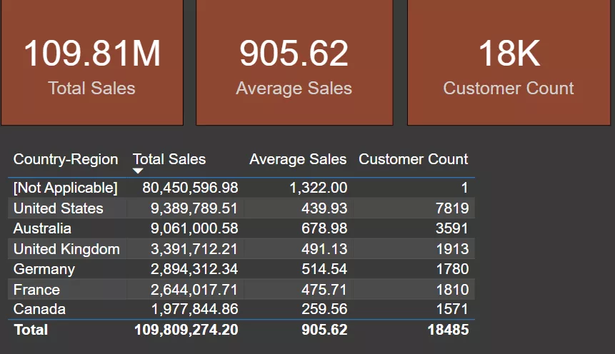
We have used Adventure Works Sales Dataset to create measures using SUM, AVERAGE, and COUNT, and visualized them with Cards and a Table.
Step-by-Step: Using IF Statements and Conditional Logic in Power BI
Step 1: Writing a Basic IF Statement
To create custom logic, DAX includes logical operators such as IF() and SWITCH(). The measure we’ll develop in this example will classify sales performance according to the Total Sales value.
- In the Data pane, right-click on the Sales table and select New measure.
- Enter the following DAX formula:
Sales Status = IF([Total Sales] > 100000, "Good", "Needs Improvement") - Press Enter.
Explanation:
- The IF() function checks if Total Sales is greater than 100,000.
- If true, it returns “Good”; otherwise, it returns “Needs Improvement”.
Step 2: Writing a SWITCH Statement (Customer Segment)
The SWITCH() function is useful when evaluating multiple conditions. We will classify Customers into different types using SWITCH().
- Right-click the Sales table and choose New measure.
- Enter the following DAX formula:
Customer Segment =
SWITCH(
TRUE(), [Total Sales] > 100000, "High Value", [Total Sales] > 50000, "Medium Value", "Low Value"
) - Press Enter.
Explanation
- The SWITCH() function checks the value of the Total Sales.
- If Total Sales is higher than 100000, it returns “High Value”.
- If Total Sales is higher than 50000, it returns “Medium Value”.
- Otherwise, it returns “Low Value”.
Step 3: Add the IF and SWITCH Measure to a Visual
- Select the table visual that we made earlier.
- Drag Customer Segment and Sales Status measures into the Columns section.
Step 4: Use IF and SWITCH in Conditional Formatting
- Open the Format pane.
- Click on the cell element drop-down, set Conditional formatting for Sales Status and Customer Segment.
- Set up rules to format the Customer Segment measure by color-coding the background color as Green for “High Value,” brown for “Medium Value,” and green for “Low Value.”
- Similarly, set up rules to format the Sales Status measure by adding icons, i.e, Green Circle for “Good,” and yellow Triangle for “Needs Improvement.” Sort the table with Customer Count.
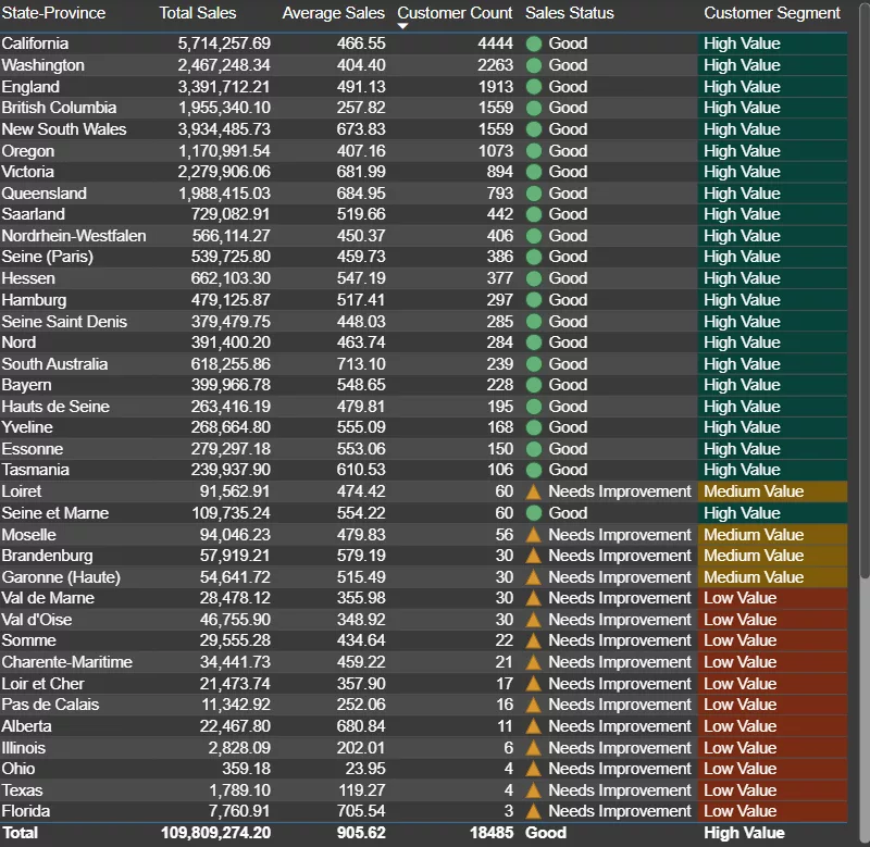
We’ve now used IF statements to categorize sales performance based on a threshold. SWITCH statements to categorize different segments dynamically. Conditional formatting to visually represent your results.
Step-by-Step: Understanding Row Context vs. Filter Context in DAX
Step 1: Understanding Row Context – Sales Per Unit
Row Context is when Power BI evaluates an expression for each row of a table individually. This is typical in calculated columns or iterators such as SUMX and AVERAGEX. This is one of the most important DAX concepts.
- In Data pane, right-click on the Sales table and select New column.
- Create a new column to calculate Sales per Unit:
Sales Per Unit = Sales[Sales Amount] / Sales[Order Quantity] - Press Enter.
Explanation:
- The formula calculates the sales per unit for each row.
- Power BI evaluates this formula row by row, which is Row Context.
Step 2: Understanding Filter Context – Sales in Australia
Filter Context is when filters are applied from visuals, slicers, or page-level filters. It influences how Power BI evaluates measures.
- In the Data pane, right-click on the Sales table and select New measure.
- Create a new measure to calculate Sales in Australia:
Sales in Australia = CALCULATE([Total Sales], SalesTerritory[Region] = "Australia") - Press Enter.
Explanation:
- CALCULATE() changes the filter context by applying the condition that Region = Australia.
- Power BI will now calculate Total Sales, but only for Australia.
Step 3: Combining Row Context and Filter Context – Sales Per Unit for Australia
Combining both contexts gives you advanced control over your calculations.
- In the Data pane, right-click on the Sales table and select New measure.
- Create a measure to calculate Sales per Unit in Australia:
Sales Per Unit in Australia = CALCULATE(
AVERAGE(
Sales[Sales Per Unit]),
SalesTerritory[Region] = "Australia"
) - Press Enter.
Explanation:
- This measure calculates Sales per Unit but only for rows where the region is Australia.
- It combines Row Context (for individual row calculations) and Filter Context (only for the Australia).
Step 4: Add all the Measures to a Visual
- Add a Funnel Chart visualization.
- Drag Sales per Unit, Sales in Australia, and Sales Per Unit in Australia into the Values section.
Total Sales is broken down into its components, with a specific focus on the Australian market and Sales Per Unit in Australia.
Why Row Context and Filter Context are Important?
- Row Context allows for row-level calculations in calculated columns or iterators like SUMX.
- Filter Context is applied via filters or slicers and is controlled using CALCULATE() to modify the context in which a measure is evaluated.
- Mastering the combination of both contexts is crucial for building dynamic and insightful Power BI reports.
Best Practices for Organizing Measures in Power BI
1. Create a Measure Table
Organizing measures in a dedicated table improves the structure of your Power BI model and keeps it easy to navigate.
Why Use a Measure Table?
- Helps to separate calculations from data tables, improving readability.
- Reduces clutter in the Data pane.
- Makes your report more professional by consolidating all measures in one place.
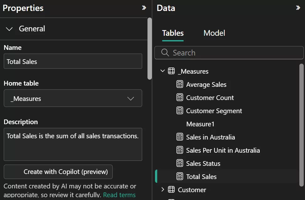
How to Create a Measure Table:
- On the Home ribbon, click Enter Data. This allows you to create a new table manually.
- Name the table something like “_Measures”. Enter a column name (e.g., Measure1).
- Click OK to create the empty table. Now, you’ll have an empty table called _Measures with a placeholder row.
- After creating the measures, drag them into the _Measures table in the Data pane.
- If you’re using the formula bar, you can directly write measures under this table.

2. Use Clear Naming Conventions
Clear and consistent naming conventions are essential for organizing and understanding your DAX measures.
Why Use Clear Naming Conventions?
- Easy to read and understand – both for you and other users.
- Helps you locate measures quickly.
- Makes collaboration easier by avoiding confusion.
3. Add Descriptions to Measures
Adding descriptions to measures is a great way to document your logic and ensure others (or future you) understand the measure’s purpose.
Why Add Descriptions?
- Helps team members or clients understand the measure.
- Makes it easier to revisit your reports after a long time.
- Provides clarity if you’re working on complex models.
How to Add Descriptions to Measures:
- Open the Model view. Right-click on the measure you want to describe in the Data pane.
- In the Properties pane, you will find the Description field.
- Enter a short explanation of the measure’s logic and purpose.
An Example of Well-Organized Measure
| Measure Name | Description |
| Customer Count | “Total number of distinct customers in the dataset.” |
Conclusion
Congratulations! You’ve just written your first DAX measures and learned how to:
- Differentiate between Measures vs. Calculated Columns
- Use basic aggregation functions like SUM, AVERAGE, COUNT
- Build IF logic and SWITCH statements
- Understand Row Context vs. Filter Context
- Follow best practices for organizing measures
Mastering DAX takes time, but this is your first powerful step! We also offer a full suite of Power BI Courses