
Timely delivery is a critical metric in supply chain operations; late shipments can affect customer satisfaction, loyalty and impact revenue. Identifying and reducing late deliveries can significantly boost customer retention and reduce acquisition costs.
Traditional Power BI visuals have limitations for visualising multi-dimensional delay data. For example, a simple bar chart or matrix might show overall lateness vs. on-time counts, but it’s hard to simultaneously analyse multiple factors (like region and shipping mode) in one view. This is where a custom visual can help.
In this blog, we demonstrate how to use Deneb (a custom Power BI visual that leverages Vega-Lite) together with GPT-5 to draft and build a specification via prompts for supply chain delay diagnostics.
Dataset Overview: DataCo Supply Chain and Late_delivery_risk
Our example uses the DataCo Smart Supply Chain dataset, which contains over 180,000 orders from 2015–2019 across global markets. Each order has a field called Late_delivery_risk, a binary flag indicating whether that order was delivered late (1 = Yes, 0 = No). Approximately 54.8% of orders in this dataset are labelled as late deliveries, making late shipments a widespread issue worth analysing. Key fields from the dataset we will use include:
- Late_delivery_risk: Indicates if a shipment was late (1) or not late (0) – this will be our core metric, essentially the percentage of orders delivered late.
- Shipping Mode: The service class or speed of shipment. The dataset includes four modes – Standard Class, First Class, Second Class, and Same Day.
- Market (Region): A categorical field grouping delivery destinations into broad regions: Africa, Europe, LATAM (Latin America), Pacific Asia, and USCA (USA & Canada). We will treat the Market as the “region” in our analysis to see geographical patterns of delay.
Why Focus on Late Delivery Risk?
This field directly captures the outcome we care about – whether an order missed its delivery target. By analysing patterns in late delivery risk, companies can uncover problem areas in their supply chain. For example:
- Customer Satisfaction & Retention: Consistently late deliveries damage customer trust. If you can get more packages to customers on time, they are more likely to stay with you and spend more money with you over time.
- Operational Efficiency: If a lot of shipments are late, it could mean that there are problems with a specific warehouse, region, or carrier. Taking care of these can make things run more smoothly.
- Cost Implications: Late shipments usually cost more (for example, urgent shipping upgrades, refunds, or discounts to make up for the delay).
Our goal is to visualise this metric across different dimensions to diagnose where and how delays are occurring and enable targeted improvements.
Choosing the Right Visual: Diagnosing the Reason Behind Late Deliveries
Before writing any code or prompting GPT-5, we sketched out the visualisation concept. The core question we want to answer is: How do late delivery rates vary by region and by shipping mode? A suitable design should let us compare late delivery percentages across these two dimensions at a glance.
Conceptual wireframe: A heatmap design showing Late Delivery Risk (%) by region (rows) and shipping mode (columns). Darker colours indicate a higher percentage of late deliveries in that category.
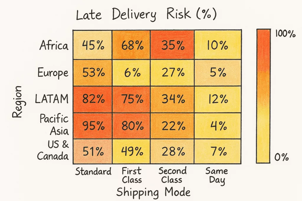
In this example wireframe, each cell’s label is the % of orders that were delivered late for the given region and shipping mode. An analyst can immediately see which regions and shipping methods are most problematic (orange/dark cells) and which are performing well (yellow/light cells).
Chosen Visual – Heatmap of Late Delivery % by Region vs. Shipping Mode: We decided on a heatmap because it intuitively highlights high vs. low values with colour intensity. One axis of the heatmap will list the Regions (markets), and the other axis will list the Shipping Modes. Each cell in the grid will display the percentage of deliveries that were late for that combination of region and shipping mode, using a colour scale (e.g., yellow-to-orange, where dark orange indicates a high late percentage). This way, we can quickly spot, for example, if “Standard Class” shipments to LATAM have an unusually high late rate, or if “Same Day” deliveries in US/Canada are almost always on time.
Such a visual would be hard to create with native Power BI charts alone, but it’s straightforward with a custom Vega-Lite specification.
In our case, we opted for the Deneb custom visual route for full control – yielding a true heatmap with a fixed colour legend, percentage labels/tooltips, and custom ordering of rows/columns.
Implementing the Visual in Power BI (Deneb Setup)
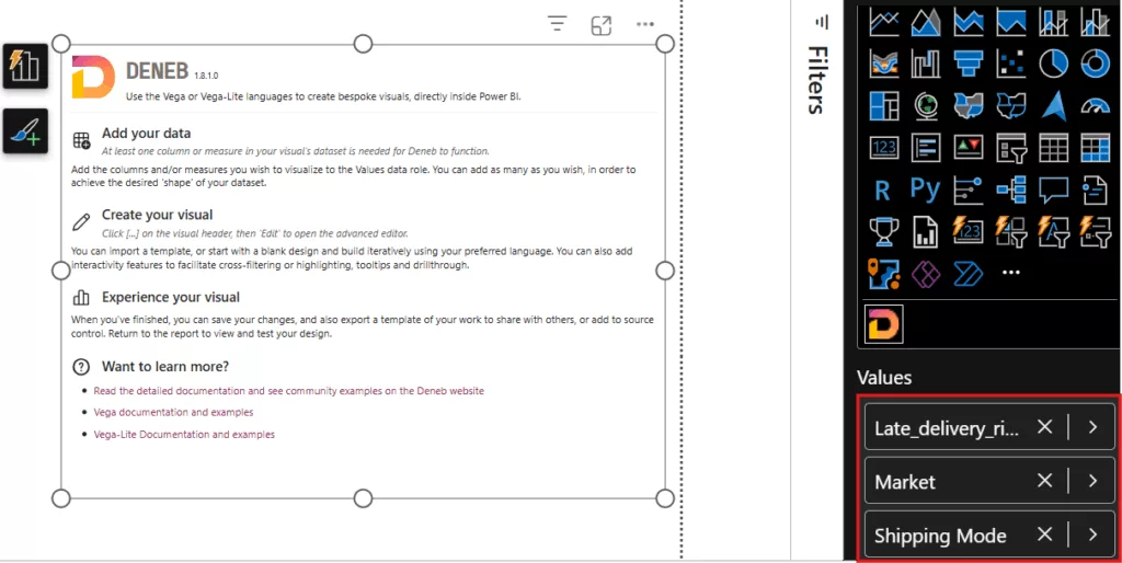
1. First, we need to set up the Deneb visual and bind our data. Deneb is available from AppSource as a certified custom visual, so you can add it via Insert > More Visuals from AppSource. Once added, the Deneb icon appears in the build pane.

2. Add the Deneb visual to the report page and resize it as needed. In the Build pane, we added Market, Shipping Mode, and Late_delivery_risk into Deneb’s Values field well. Deneb automatically makes these available to the Vega-Lite spec (as the dataset table we referenced in JSON). Ensure Late_delivery_risk is it’s not being summed; set it to Don’t summarize.
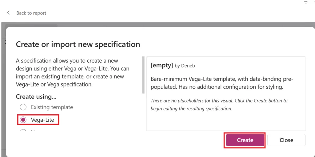
3. Open the Deneb visual editor by selecting the visual and clicking Edit. Select Vega-Lite and click on create.
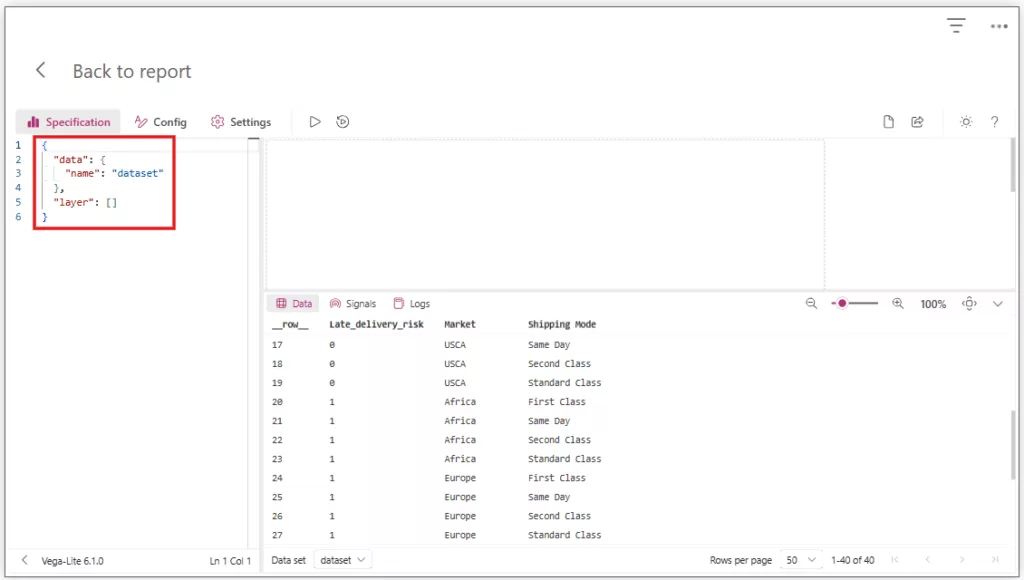
4. You’ll see a code editor where you can paste the Vega-Lite JSON.
Building the Vega-Lite Spec with GPT-5
Creating a custom visual in Power BI via Deneb means writing a Vega-Lite JSON specification for the chart. Hand-coding this spec can be time-consuming if you’re not already fluent in Vega-Lite. Here’s where GPT-5 comes in as a coding assistant. Large language models have been trained on lots of code and JSON (including Vega/Vega-Lite specs), so they can generate plausible chart specs given the right prompt. We leveraged GPT-5 to help write the heatmap specification, approaching the task in a step-by-step, iterative manner.
Outline the Requirements in a Prompt: We began by writing a detailed prompt for GPT-5 describing the visualisation and our data. This prompt included:
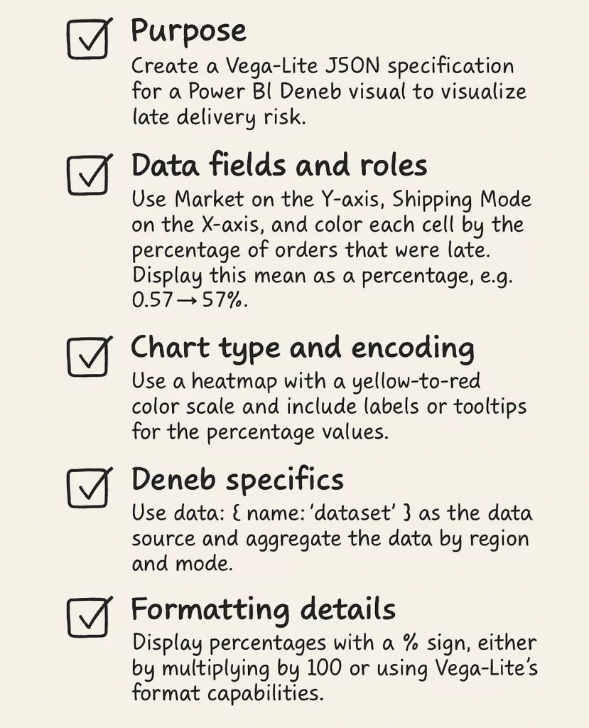
Final Initial Prompt:
“Create a Vega-Lite JSON spec for a Power BI Deneb visual to visualise late delivery risk.
Dataset fields:
- Market → Y-axis (categorical).
- Shipping Mode → X-axis (categorical).
- Late_delivery_risk (0 = on time, 1 = late) → compute percentage late.
Requirements:
- Chart type: Heatmap (rectangular grid).
- Each cell’s colour encodes the % of late deliveries for that region/mode.
- Use “data”: {“name”: “dataset”} as the source (Deneb convention).
- Aggregate by Market + Shipping Mode, calculate mean of Late_delivery_risk (fraction late).
- Map colour scale from yellow (low %) to orange (high %), domain [0,1].
- Show tooltip with Region, Mode, and % Late Deliveries formatted nicely (e.g. “57%”).
- Add legend titled “% Late Deliveries”, values formatted as percentages.
- Rotate x-axis labels by 45° for readability.
- Clean layout: remove gridlines and chart border.”
GPT-5’s Initial Output: GPT-5 responded with the following Vega-Lite JSON specification.
{
  "$schema": "https://vega.github.io/schema/vega-lite/v5.json",
  "data": {"name": "dataset"},
  "mark": {
    "type": "rect",
    "stroke": null
  },
  "encoding": {
    "x": {
      "field": "Shipping Mode",
      "type": "ordinal",
      "axis": {
        "labelAngle": 45,
        "title": "Shipping Mode",
        "grid": false
      }
    },
    "y": {
      "field": "Market",
      "type": "ordinal",
      "axis": {
        "title": "Region",
        "grid": false
      }
    },
    "color": {
      "aggregate": "mean",
      "field": "Late_delivery_risk",
      "type": "quantitative",
      "scale": {
        "domain": [0, 1],
        "range": ["#ffffb2", "#fe9929"]
      },
      "legend": {
        "title": "% Late Deliveries",
        "format": ".0%"
      }
    },
    "tooltip": [
      {"field": "Market", "title": "Region"},
      {"field": "Shipping Mode", "title": "Mode"},
      {
        "aggregate": "mean",
        "field": "Late_delivery_risk",
        "title": "% Late Deliveries",
        "format": ".0%"
      }
    ]
  },
  "config": {
    "axis": {
      "domain": false,
      "grid": false
    },
    "view": {
      "stroke": null
    }
  }
}
Testing and iteration: We loaded GPT-5’s initial Vega-Lite specifications into the Deneb editor.
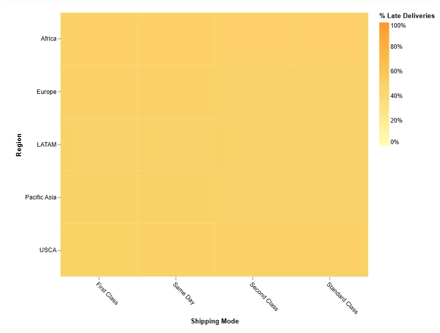
That revealed an issue: every cell showed roughly “50%” late risk, indicating the spec wasn’t yet calculating percentages by region and mode correctly.
So, we went back to GPT-5 with follow-up instructions to address the issues:
We asked GPT-4, Why does every cell show roughly ‘50%’ late risk?
Based on prompt–adjust–review cycle, we created Pct Late DAX Measure given by GPT-5 to compute the average of the late flag, so Power BI itself can provide the already-aggregated percentage for each category. Remove the Late_delivery_risk from the Deneb fields and add the Pct Late instead.
Pct Late = AVERAGE ( ‘Table'[Late_delivery_risk] )
Further, we tuned the Heatmap by asking GPT-5 to add text labels on each rect mark to directly show the % value inside each cell.
Below is a final version of the final Vega-Lite JSON spec for the late delivery risk heatmap that met all our requirements:
{
  "$schema": "https://vega.github.io/schema/vega-lite/v5.json",
  "data": {"name": "dataset"},
  "encoding": {
    "x": {
      "field": "Shipping Mode",
      "type": "ordinal",
      "axis": { "labelAngle": 45, "title": "Shipping Mode", "grid": false }
    },
    "y": {
      "field": "Market",
      "type": "ordinal",
      "axis": { "title": "Region", "grid": false }
    }
  },
  "layer": [
    {
      "mark": { "type": "rect", "stroke": null },
      "encoding": {
        "color": {
          "field": "Pct Late",
          "type": "quantitative",
          "scale": { "domain": [0, 1], "range": ["#ffffb2", "#fe9929"] },
          "legend": { "title": "% Late Deliveries", "format": ".0%" }
        },
        "tooltip": [
          { "field": "Market", "title": "Region" },
          { "field": "Shipping Mode", "title": "Mode" },
          { "field": "Pct Late", "type": "quantitative", "title": "% Late Deliveries", "format": ".0%" }
        ]
      }
    },
    {
      "mark": { "type": "text", "baseline": "middle", "fontWeight": "bold", "size": 12 },
      "encoding": {
        "text": { "field": "Pct Late", "type": "quantitative", "format": ".0%" },
        "color": {
          "condition": { "test": "datum['Pct Late'] >= 0.6", "value": "white" },
          "value": "black"
        }
      }
    }
  ],
  "config": {
    "axis": { "domain": false, "grid": false },
    "view": { "stroke": null }
  }
}
Final Heatmap Visual for Late Delivery Risk Diagnostics: We can observe that some regions shipping via First Class have most of their orders arriving late (deep orange cells), whereas Standard Class deliveries in the USCA region are almost all on time (yellow coloured cell with a very low late percentage). Such insights direct management attention to the worst-performing combinations.
Using GPT-5 to Improve the Spec: AI as a Co-Developer
It’s worth thinking about how GPT-5 helped with this process of development. Instead of authoring the Vega-Lite standard all by hand, we used GPT-5 as a co-developer to swiftly write code snippets based on our directions. This experience teaches us a few things about how to use AI in BI development:
- Prompt quality matters: The detail and clarity of your prompt largely determine the quality of the AI’s output. We spent time crafting a thorough prompt with field names, goals, and even examples. That initial effort paid off by yielding a mostly correct spec structure on the first try. Vague instructions would likely have produced a useless result, requiring far more back-and-forth.
- Iterative refinement is key: The first output from GPT-5 was not perfect. We had to guide the AI step-by-step – identifying issues (like the missing percentage calculation). This iterative loop is essential; GPT-5 doesn’t inherently know our exact needs, but it responds well to specific corrections.
To learn more about ChatGPT and Power BI, check out our course here:
ChatGPT Essentials for Data Analytics and Power BI Training
Conclusion
Using GPT-5 and Deneb, we built a custom Power BI visual that reveals late delivery patterns across shipping modes and regions. This technical walkthrough covered the entire process – from defining the problem and sketching a wireframe, to prompt engineering with GPT-5, to iteratively developing the Vega-Lite spec, implementing it in Power BI, and analysing the results. The outcome is a powerful diagnostic tool for supply chain analysts: an interactive heatmap that immediately highlights where on-time delivery performance is lagging.