
A pivot table is an Excel tool that summarises a large table of data into a compact, interactive report. In a few clicks it groups your data and calculates totals, counts or averages, so you can answer questions like “total sales by region” without writing a single formula. To create one, select your data and choose Insert > PivotTable.
Pivot tables have a reputation for being advanced, but they are one of the easiest ways to make sense of a big spreadsheet, and you can build your first one in under a minute. This guide explains what they are, walks you through creating one step by step, and covers the everyday tasks you will actually use.
What is a pivot table in Excel?
A pivot table (Microsoft calls it a “PivotTable”) is an interactive summary of a larger table of data. You give it a long list of raw records, say, thousands of individual sales, and it groups and totals them the way you choose, instantly.
Imagine a sheet with 5,000 rows of sales, each showing a Region, a Product, a Salesperson and an Amount. A pivot table can turn that into a tidy report of total sales by region, or sales by product for each region, in seconds. When you want to see it a different way, you drag a field, and the whole report rearranges, or “pivots.” That is where the name comes from.
The key point for beginners: a pivot table does the grouping and the maths for you. You do not write any formulas.
When should you use a pivot table?
Use a pivot table whenever you have a long list of records and you want to summarise it. Typical questions it answers in a few clicks:
- Total sales by region, month or salesperson.
- How many orders each customer placed.
- Average order value by product category.
- A cross-tab, for example products down the side and regions across the top.
If your data is a short list you can read at a glance, you do not need one. Pivot tables earn their keep the moment your data is too big to summarise by eye.
How do you create a pivot table in Excel?
Here is the full process with a sales example. It takes about a minute.
- Tidy your data first. Make sure every column has a single, clear heading (Region, Product, Salesperson, Amount) and there are no blank rows or columns inside the data. For best results, select your data and press Ctrl+T to format it as a proper Excel Table.
- Click any cell inside your data.
- Go to Insert > PivotTable. Excel confirms the data range. Choose New Worksheet and click OK.
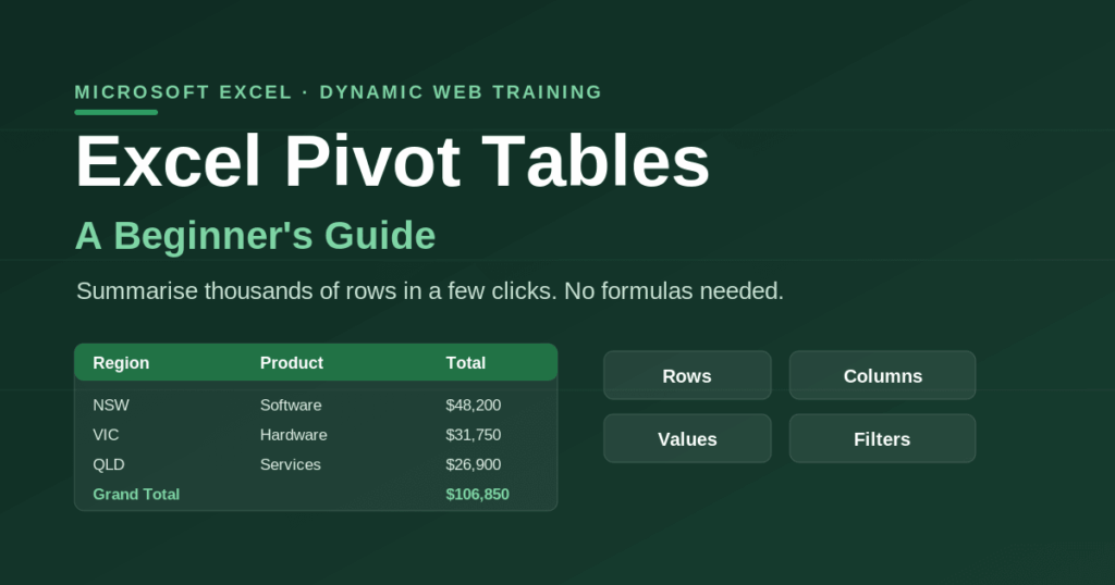
- You will see the PivotTable Fields pane on the right, listing your column headings, with four areas below: Filters, Columns, Rows and Values.
- Drag a field into Rows to group by it. Drag Region to Rows and you get a list of regions.
- Drag a field into Values to summarise it. Drag Amount to Values and Excel shows the total sales for each region automatically.
- Add a second dimension if you like. Drag Product to Columns to see sales for each product within each region, a full cross-tab report.
That is a working pivot table. Everything after this is refining it.
What do the Rows, Columns, Values and Filters areas do?
The four areas are the whole game, and they are simpler than they look:
- Rows: the field you want listed down the left (for example, Region). This groups your data.
- Columns: a field spread across the top, to create a cross-tab (for example, Product).
- Values: the number being calculated (for example, Amount). By default Excel sums numbers and counts text.
- Filters: a field that filters the whole report from a dropdown at the top (for example, Year), without changing the layout.
Drag fields between these areas and the report updates instantly. This is the “pivoting” that makes the tool so powerful.
How do you change what a pivot table calculates (sum, count, average)?
By default Excel adds up numbers. To change that, right-click any number in the Values area and choose Value Field Settings (or Summarize Values By), then pick Sum, Count, Average, Max, Min and so on. So the same Amount field can show total sales, the number of sales, or the average sale, just by changing this setting.
To make the numbers readable, use the same Value Field Settings dialog, click Number Format, and apply a currency or thousands format once for the whole field.
How do you refresh a pivot table when your data changes?
A pivot table does not update automatically when you edit the source data. To update it, right-click anywhere in the pivot table and choose Refresh, or go to PivotTable Analyze > Refresh.
One tip that saves beginners a lot of trouble: if you built your pivot table from an Excel Table (the Ctrl+T step above), new rows you add to the source are included automatically when you refresh. If you selected a fixed range instead, you have to update the range manually under PivotTable Analyze > Change Data Source.
How do you sort and filter a pivot table?
To sort, right-click a value or label and choose Sort, for example sort regions by total sales, highest to lowest. To filter, click the dropdown arrow on a Row or Column label, or drag a field into the Filters area for a report-wide filter. For a friendlier filter, select the pivot table and add a Slicer (Insert > Slicer), which gives you clickable buttons.
What are the most common pivot table mistakes (and how to fix them)?
Three issues trip up nearly every beginner:
- Messy source data. Blank rows, merged cells or missing column headings will break a pivot table or produce odd results. Fix: make sure your data is one clean block with a single heading row, and format it as a Table.
- Forgetting to refresh. Changed the data but the pivot table looks the same? It has not refreshed. Fix: right-click > Refresh.
- New rows not appearing. You added data but it is not in the report. Fix: build from an Excel Table so the range grows automatically, or update the data source manually.
What is a PivotChart?
A PivotChart is the visual version of a pivot table, a chart that stays linked to the summary and updates as you filter or pivot. Create one with your pivot table selected via PivotTable Analyze > PivotChart, or straight from your data with Insert > PivotChart. It is the fastest way to turn a summary into a dashboard-style visual.
How do you get better at pivot tables?
The basics above cover most everyday needs, but pivot tables go much deeper: calculated fields, grouping dates into months and quarters, showing values as a percentage of the total, and connecting slicers across multiple pivot tables to build dashboards. Pivot tables are also faster to build with Copilot; you can ask Microsoft 365 Copilot to create one from a prompt, though it helps to understand the fundamentals so you can check its work.
If you want to go from confident beginner to genuinely fast, our hands-on Advanced Excel Training Course covers PivotTables, PivotCharts and data analysis on real business data with a Microsoft Certified Trainer, and the Excel for Data Analysis Course takes you into Power Pivot for very large datasets. If you are still building your formula skills, our guides to XLOOKUP and VLOOKUP vs XLOOKUP vs INDEX/MATCH pair well with pivot tables.
For the bigger picture, this guide is part of our Complete Guide to Microsoft Excel.
Frequently asked questions
A pivot table summarises a long list of data into a compact report. It groups your records and calculates totals, counts or averages, so you can quickly answer questions like total sales by region or the number of orders per customer, without writing formulas.
Click any cell in your data, go to Insert > PivotTable, and choose New Worksheet. In the PivotTable Fields pane, drag a field to Rows to group your data and a number field to Values to summarise it. Excel builds the report automatically.
No. A pivot table does the grouping and the calculations for you. You just drag fields into the Rows, Columns, Values and Filters areas, and Excel produces the totals, so it is ideal for people who are not confident with formulas.
Right-click anywhere in the pivot table and choose Refresh, or go to PivotTable Analyze > Refresh. Pivot tables do not update automatically when the source data changes. If you built it from an Excel Table, new rows are picked up on refresh.
Two common reasons: you have not refreshed it (right-click > Refresh), or your new rows fall outside the original data range. Building the pivot table from an Excel Table (Ctrl+T) fixes this, because the range expands automatically.
Yes. Right-click a value and choose Value Field Settings, then select Average (or Count, Max, Min). The same field can show a total, a count or an average just by changing this setting.
